
Landing Pages - What They Are And Why We Use Them

Let’s get right to the point. After all, we’re here to talk about landing pages.
In its purest sense a landing page is exactly as it sounds, a single web page that a visitor can arrive at or ‘land’ on, typically a homepage or welcome page.
However, when dealing with landing pages for the use of paid marketing and advertising, it would be far more appropriate to refer to a landing page as being a dedicated, standalone web page, one that operates independently from your main website and where traffic is sent specifically to prompt a certain action or result. It has been designed for a single focused objective – to give the visitor exactly what they came for and accomplish conversion.
This means that your landing page remains free from the plethora of buttons, banners and blinking lights that typically concuss a visitor as soon as they arrive, and then ultimately sends them packing after they’ve had enough. And without the need for global navigation to tie in to your primary website, there’s very little reason for a visitor to leave once they have landed – all the while guiding them to your intended conversion goal. Right to the point.
Click Through landing pages are aptly named as their goal is to persuade the visitor to ‘click through’ to a destination page. They can be used to describe a product, service or any other offer in sufficient detail, whetting the visitor’s appetite to the point where they are much closer to completing that all important conversion.
The destination page is typically the shopping basket or registration page. All too often, traffic is directed immediately to these pages, rendering the visitor dumbstruck with an abundance of irrelevant information, asking too much of a commitment without first securing their interest. It’s like being asked to pay for your meal before you’ve even looked at the menu and ordered – you’re going keep hold of your money and run for the door. But with the right click through landing page in place, visitors are sufficiently informed beforehand and the chances of a successful conversion are much higher.
Lead Generation landing pages are used to capture data, often trading incentives (usually what the visitor was searching for in the first place) in exchange for contact information, such as a name or email address, allowing you to market to and connect with the prospective at a later time.
Regardless of what kind of landing page is being used, the aim is always for a successful conversion, making the process as appealing and straightforward for the visitor as possible.
If a landing page is crafted well enough, it will almost certainly sport better conversion rates than simply dumping people into your homepage. As mentioned above, home pages are typically fraught with any number of links that won’t necessarily represent your conversion goal, instead diverting traffic away to some other page and ultimately reducing your conversion rate.
The problem of course is that home pages are designed for a broader, more general purpose. If the visitor clicks on an ad for a specific deal and then lands on the company’s welcoming page, they might have to go through pages of irrelevant information before they eventually find what it was they wanted, each page acting as an unnecessary distraction, perhaps disconcerting the visitor by diluting the original message and ultimately losing a potential conversion altogether.
Because your landing page is intended for one purpose only – directing the visitor to the information they were looking for – the original message remains potent, the visitor is assured they made a ‘good click’, and the chances of a successful conversion are far more likely.
Essentially you’re offering the visitor precisely what they came for, making the process of finding it a whole lot easier and giving them little to no excuses for not committing to the transaction.
If a landing page is crafted more than well enough, has undergone rigorous changes and testing – (otherwise known as Split Testing) – for optimal performance, then it will almost certainly sport better conversion rates, depending of course on what changes you’ve decided to stick with.
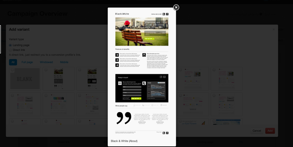
Image: An Example Clickthroo Landing Page Template
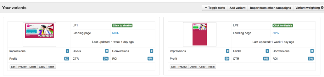
Split Testing is essentially a process of experimentation, running simultaneous tests between two or more variants of the same page to see which performs or converts best.
With traffic randomly assigned to each page variant, where visitors are typically cookied so that they will always see the same version of that page, the integrity of the test remains constant and the page that performs best can be rightfully established.
There are any number of elements to a landing page that can be tested, and at the end of the day it will ultimately be determined by the visitor what changes need to be made. Like the proverbial menu mentioned earlier, a customer will only order what they want if they like the way it has been presented to them.
Split Testing can be undertaken at any point, whether you’re just starting out from scratch, or whether you’ve got an existing campaign that needs tinkering with.
If you already have an established landing page that is performing more than adequately enough (champion page), you can always introduce some new variants into the mix (challenger pages) as it is often a good idea regularly check to see if any element can be improved upon. Just remember to provide new challenger pages with a smaller amount of traffic than that of the your current champion page, or else risk the majority of your campaign to the kinds of teething problems typically inherent of new ideas.
Image: Split-testing With Clickthroo
Some elements to consider testing include:
- The main headline – typically a break down of your product, service or any other offer.
- Some words might work better than others, getting the message across more clearly. Whilst some words can be optimized for search engine results, ensuring the visitor is immediately in sync with your message before they’ve even landed and providing them with a stronger sense of affirmation in what you are offering.
- The call to action – this is the text within the button that represents your conversion goal. You want your visitor to hit this button to complete conversion, so ideally the text needs to contain a clear, concise message that not only properly informs the visitor where to click but also encourages them to do so.
- Button colour – very self explanatory, but a science in itself. Different colours have different connotations. You want your visitor to associate that colour, and by extension that potential transaction, with something positive, all the while pertaining to your brand identity or the product that is on offer.
- Graphics and photography – using an image to depict your product or offer is a clear indication to the visitor that they’ve arrived at the right place. However, a picture is worth far more than just a thousand words and depending on the context of the image, a visitor may or may not complete conversion. You can build an entire narrative around a single image and provoke an emotive response from the visitor, one that either prompts or dissuades them them from completing conversion.
- Form length – in the interest of keeping your visitor fully engaged, it’s important to minimise the amount of fields that visitors are required to complete. However, if your aim is to capture as much data as possible (Lead Generating, for example) then cutting down these number of fields may not be an option. Instead, you can test different variations to the order these fields are completed, varying the amounts of information each time, and stick with the one that performs best.
Try the Clickthroo Landing Page Marketing Solution: Free For 14 Days
(Landing page builder, integrated tracking platform, A/B split testing, traffic segmentation, template and image libraries, integrated trafic sources, optional affiliate marketing module, and much more…)


Leave a Reply
Want to join the discussion?Feel free to contribute!