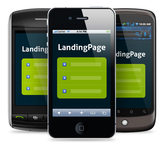
The 7 Essential Rules of Mobile Landing Page Optimization
When it comes to landing page optimization, testing various designs and layouts may increase conversion rate, but such incremental improvements are not so impressive if a significant number of mobile visits – and mobile user behaviors – are being ignored. With mobile web use dramatically on the rise, it’s vastly important you adapt your strategy. Instead of just designing a traditional landing page, consider landing page content and layout for smartphones and various other mobile devices as well.
Here are the 7 essential rules of mobile landing page optimization:
Everything Should Work Flawlessly
First things first, unless you want to eliminate your chances of conversion, you need to ensure that your landing page content is available and visible for all mobile devices. Not all mobile devices support flash and those that do, don’t always execute it as well as would a desktop browser.
- Consider more mobile-friendly alternatives like HTML5, jQuery, and JPG or GIF image formats to ensure compatibility right across the board.
Keep it Quick
Consider your mobile device users for a moment, they want to access information quickly and efficiently, that’s the whole idea of browsing on the move.
- Mobile landing pages should be lightweight (less than 20 KB total), with a minimal, efficient design that caters to a smaller screen. Aside from improving readability, this will also prevent any lag or slow-down on smartphones and tablets.
Simplify Navigation
Traditional landing page practices dictate that navigation should be simple as possible and the same goes for mobile tactics, too.
- Present your mobile landing page as a single column layout with the priority content at the top. You want to reduce the number of actions (taps, clicks, swipes etc.) as possible, so always place your conversion goal “above the fold” – i.e. before the point where the user must scroll down to view the rest of the page.
Image: Kumon mobile landing page. Call-to-action appears at the top of the page to avoid scrolling through less important content first, which is situated below (source. bluetrainmobile)

Design for Readability
Users are often looking at their devices from arm’s length, so they need to be able to view your content without having to enlarge specific areas of the page.
- Ensure all text is legible. The minimum font size should ideally be about 16 pixels in order to cater for most smartphones, which typically have a four-inch screen size. Create good contrast between background and text, and use a simple color palette that doesn’t overwhelm or distract from crucial information.
- Likewise, users shouldn’t have to zoom-out and track the page in order to access areas otherwise out of view. This creates a poor user-experience and is a guaranteed way of killing your chances of conversion. Furthermore, asking the user to track the page and move your content around leaves the position of your conversion goal at the mercy of your visitors.
- Minimize your Ad Copy and try to communicate your value proposition in just one or two sentences. Screen sizes vary, so reduction may be anything from 65 percent for tablets and 35 percent for smart phones. Render down the relevant information into clear, concise propositions and use bullet points to drive any main points home, steering always toward conversion.
- Keep your headline brief. Three or four words should be enough to message match and reassure the user that they have arrived at correct page.
Design for Clickability
Small, compact content can be tricky to click for mobile. Especially if your users are fumbling at their smartphones outside in the freezing cold. All actionable targets need to be clickable without having to zoom or increase the size of the page.
- Utilize negative space and create a buffer between clickable areas to prevent frustrating miss-clicks.
- Use large buttons to reduce accidental clicks and add drop shadows to increase their surface area. Minimal target area suggestions are 44×44 pixels (Apple) and 38×38 pixels (Microsoft).
Image: Audi landing page. The call-to-action button is clear, easy to click, and separate from any other clickable areas on the page (source. conversionvoodoo)

Implement Click-to-Call
Regardless of your conversion goal, you should always enable your mobile landing page with click-to-call functionality.
You may be putting out a mobile landing page for that very reason. After all, “61% of mobile users call after making a local business search” according to Google Mobile Movement Study, 2011. And click-to-call is a very effective way of capturing customer data and generating future sales leads.
Image: Perfect example of a simple yet effective click-to-call button (source. madisonlondon)
Even a mobile landing page that has been specifically designed for pay-per-click can benefit from including a click-to-call function. When most visitors arrive at your landing page, some may come with an intent to purchase, whilst many will remain hesitant, seeking that extra ‘proof’ or ‘trust’ in order to validate their purchasing decision. Providing users with an easy option to call not only enhances the user experience, but also creates an opportunity to sell person-person, or at the very least generate a lead in an interested party for any future sales.
Here are some very useful tips to consider when implementing click-to-call:
- Include a phone icon for quick visual association. Users should be able to spot the call button whilst quickly scanning over the page.
- Include a call-to-action in the link text. Phrases like “Contact Support” or “Call Now” reassures users where to click, and validates their decision to act.
- Always include the international prefix to ensure it works for users outside of your area code. And display the telephone number in the link text for easy verbal sharing.
Test Specifically for Mobile
Mobile is still regarded as such a new space that many of the old assumptions and best practices for desktop may not apply.
However, the fundamentals of conversion optimization are still the same. A healthy practice of A/B testing to see what works best should improve your mobile landing page performance, and help distinguish the best practices between desktop and mobile landing pages overall.
Try the Clickthroo Landing Page Marketing Solution: Free For 14 Days
(Landing page builder, integrated tracking platform, A/B split testing, traffic segmentation, template and image libraries, integrated traffic sources, optional affiliate marketing module, and much more…)