
Clean Landing or Crash Landing? Mortgage Landing Pages Critiqued
It’s landing page critique time, and today I’m taking a look at landing pages from the mortgage sector - ‘mortgage’ being the third most expensive keyword on Google AdWords. Following last week’s appeal we have received several landing page critique requests for the niche ‘interest only mortgage‘.
Each landing page will be looked at from the point of view of the user in order to determine whether the page delivers a clean, successful landing, or a bad one. Areas that require attention will be highlighted and suggestions for improvements will be made along the way.
MortgageLoan
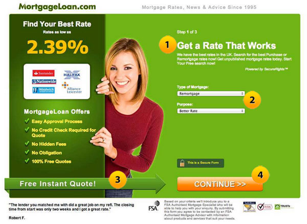
1. No message match
We received several landing page samples in relation to the mortgage sector, based upon the keyword search ‘interest only mortgage’, so it’s pretty disappointing to see there is no message match here. Trying something as simple as “Get an interest only mortgage that works” would definitely sort out this problem.
2. Lost in space
Utilizing negative space can often be a good thing, allowing the most important elements on the page plenty of room to ‘breathe’. But the two tiny dropdown menu’s here seem lost and insignificant. We know that they are there, somewhere amidst the emptiness, we can just about see them, but we’re not entirely sure why. Some directional cues (arrows, etc to draw the eye) would certainly help clear things up.
3. Weak directional cue
This is definitely a good spot for a directional cue, but the one here doesn’t exactly pop-out so much as timorously blend in with the rest of the page, almost as if they were afraid of seeming too pushy. It’s a smart looking element, but it does absolutely nothing to catch the eye.
4. Continue to what?
This call-to-action isn’t exactly terrible, and being a step landing page, its function is indeed to ‘continue’ to the following page, but they could have been more engaging with the button text. Something along the lines of “Click for my free quote” should be tested.
Our verdict
On first impression, this looks like a really nice landing page. But the absence of any kind of message match alone is enough to declare this a Crash Landing.
Remortgage Quotes Online
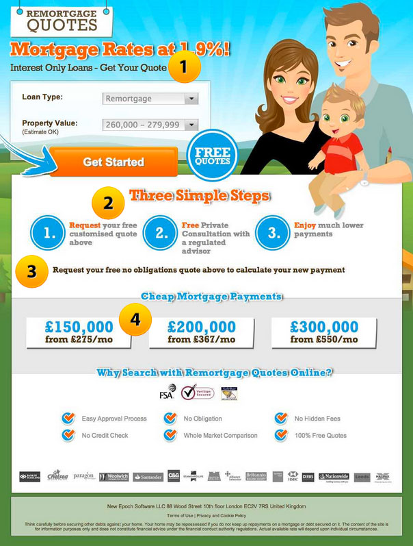
1. Message miss-match
Okay, so this time there’s a little improvement on the message match, but the selected niche is for ‘interest only mortgage’, and not ‘loans’. This might seem a little petty, but there’s no such thing as overstating the importance of a good, strong message match. We suggest running different landing pages that have been optimized for different search terms, one for ‘interest only mortgage’, one for ‘interest only loan’, and one for any other variation thereof.
2. Too much going on
There’s far too many icons cluttering up this space and drawing attention away from the CTA button, despite the valiant efforts of the big, blue arrow showing us where to click. I would remove the ‘free quotes’ icon and use that copy for the button text instead of what they’re currently using. Then we’d reduce the size of the number icons below, perhaps grey-scaling them in the process. It’d certainly be an interesting element of the page to test.
3. Never track back
Asking the user to request a free quote ‘above’ means tracking back through what they’ve already read in order to get to where you want them to go. Landing pages should always drive the user toward conversion, but not if that means doubling back on themselves – it breaks continuity and results in a poor user experience. We suggest removing this element entirely, and putting in a second CTA button somewhere towards the lower half of the page, one that demands an immediate action rather than asking the user to go elsewhere.
4. Needs social proof/testimonial
Using stats and figures as a way of showcasing the benefits of the service to the customer is all well and good, but it really needs a testimonial here to back them up. A simple quote from a satisfied customer would be best, preferably accompanied by a picture.
Our Verdict
Another nice looking landing page, and one that seems altogether well thought out on first inspection. But it’s far too cluttered for out liking, in a way that goes beyond preference, constantly drawing attention away from the most important element of the page. But all of this could be easily fixed with the suggestions we’ve made. Crash Landing
Yes Finance
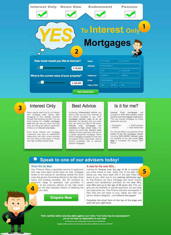
1. Good message match
At last, we’ve finally landed on a page that includes the keyword search ‘interest only mortgage’ in the main headline.
2. Requires sub heading
Even though the headline includes our target niche, the absence of a sub heading is still a little jarring. There’s no real explanation as to what the page is about and the benefits it can offer. We would recommend something along the lines of: “Get a free quote on a better mortgage deal”.
3. Too much copy text
There’s just far too much copy text to read here. Granted, it comes after the CTA, so if users want to read more before they commit to requesting a quote then they can, but it still looks bloated and confusing. We recommend clear, concise value-orientated bullet points to the break down the information and explain the benefits more readily.
4. Contact telephone number required
Again, this is far too much copy text for a single element. And after the user has read through it, they are asked to back track to the top of the page. The inclusion of a contact telephone number at this point would be much more beneficial to the business.
5. Segment traffic
Ending with ‘a note for the over 60’s’ looks too much like an afterthought. Our first instinct would be to segment traffic coming from AdWords, and optimize a version of the page that caters specifically to ‘mortgage quotes for the over 60’s’.
Our verdict
This one is little tougher to critique. The upper half of the page does almost everything right that the upper half of a landing page is supposed to do; the headline is relevant, the data form and CTA is clear and succinct, but the absence of any sub header is something that should be addressed. Also, the rest of the page looks and feels a little bit clunky. It’s would need trimming down before we were completely happy with it. Crash Landing
Next Week’s Clean Landing or Crash Landing
Next week we will be critiquing landing pages in the ‘Personal Trainer‘ sector so we welcome any example landing page examples for review. Please send the URL of your landing page examples to [email protected].
Try the Clickthroo Landing Page Marketing Solution: Free For 14 Days
(Landing page builder, integrated tracking platform, A/B split testing, traffic segmentation, template and image libraries, integrated traffic sources, optional affiliate marketing module, and much more…)